CSS-only auto spatial hierarchy with container style queries
I wasn’t particularly interested in the new CSS container style queries at first — I mean, we already have inheritance and attribute queries, right?
But then in the shower this morning the pieces started to fall together for how this feature could finally catch one of my CSS white whales: proportional nesting values!
The law of spatial hierarchy
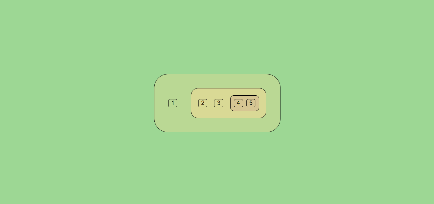
If you’ve ever worked with a designer or studied visual design at all, you know about hierarchy. One of the common rules of spatial hierarchy is that related elements should be closer to one another, and unrelated ones should be further away.
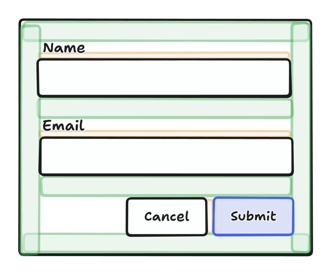
In the above wireframe, I’ve highlighted the spatial hierarchy principle in action: form labels and grouped buttons are much closer to one another than the fields are.
For this reason, designs will often use progressively smaller spacing values as container nesting increases. For example, the fields in a form may be spaced with --space-md, while the label and input are spaced with --space-sm, visually “grouping” them together.
It’s generally up to developers to pay attention to spacing sizes and implement them appropriately. But this manual effort can only go so far. One of the problems with flattening systematic rules into coded values is you lose ‘contextuality.’ Understanding of context is moved from the system to the implementer (designer / developer), so the computer (which is good at consistent logic) cannot help us remain consistent and logical anymore.
I’ll follow this up with a more in-depth thoughts later on, but first let’s dive into what didn’t work before @container style and what works now.
Using conditionals to power proportional nested values
So, fundamentally, what we want to do is this:
If a box is nested within another box, its spacing values (gap, padding) should be proportional to the parent
What didn’t work before
Like I said, this has been a white whale for a bit. I’ve attempted this kind of thing before, but it never worked due to circular property references. Consider the following CSS:
.box {
	--spacing: calc(var(--spacing) / 2);
}
Theoretically this expresses our rule, and in an imperative programming language this would work.
let spacing = 1;
spacing = spacing / 2; // just fine!
But in CSS this doesn’t work, because this is a property declaration, not an assignment. The value of calc(var(--spacing)... used to “assign” --spacing isn’t referencing the parent scope; it’s referencing our --spacing: a circular reference. If you try this and open your inspector, you will see that the end result is --spacing is not defined at all.
And for a long time, that was a dead end. No amount of clever tricks I could think of (e.g. having two different variables) would violate this circular logic. It seemed mathematically impossible with the way CSS is designed.
What works now
Leveraging @container style(), we can indeed get this working with a clever trick.
Let’s jump right to the demo, and then I’ll explain.
How it works
To start off, I’m establishing a system of custom properties to “smuggle” an inherited value past the circular reference problem:
--ctx-mode: A generic1/2state value which tells us which “mode” the current nested element is in. Keep reading.--ctx-nest-1: “Mode 1” nesting variable. To avoid circular referencing, this computes itself from--ctx-nest-2.--ctx-nest-2: “Mode 2” nesting variable. To avoid circular referencing, this computes itself from--ctx-nest-1.
Now, I’d tried something like this before, but the problem is that to make this work fully automatically with no other JS or markup required, you’d have to apply CSS like so:
--ctx-nest-1: calc(var(--ctx-nest-2) / 2);
--ctx-nest-2: calc(var(--ctx-nest-1) / 2);
… thus arriving at a circular reference again. Why? Because if we refuse to force developers to treat nested elements any differently (like, applying a mode-1 or mode-2 class), both of these properties need to be defined on every element, and we had no way of saying “alternate nesting elements” to only apply one at a time. Normal CSS nesting selectors like .box .box { also wouldn’t work, because the same rules will be applied to every nesting element, not every other alternating nested element.
This is all recursive stuff and kind of hard to think about, so don’t worry too much if my explanations aren’t sufficient… It does work.
Breaking it down
We can use @container style(--ctx-mode: ...) to solve this problem by creating two style queries which do the alternation for us. They are mirror images of each other, so I’ll just break down the first one.
@container style(--ctx-mode: 1) {For elements with mode: 1
.box {Which also have the box class
--ctx-mode: 2;Flip mode to 2 (we are nesting now)
--ctx-nest-2: calc(var(--ctx-nest-1) / 2);Compute the new nesting multiplier from our parent’s (who is mode 1, since we are mode 2).
--ctx-nest: var(--ctx-nest-2);Assign our common-use property from the active mode’s value.
Then we add the inverse CSS for style(--ctx-mode: 2).
Now nested boxes will have alternating --ctx-nest and values which gradually get smaller! Behind the scenes, this is what it looks like.
- Box 1:
--ctx-nest: 1,--ctx-nest-1: 1;(default value, no@container stylequery matches)- Box 2:
--ctx-nest: 0.5,--ctx-nest-2: 0.5;,--ctx-nest-1: 1;(inherited)- Box 3:
--ctx-nest: 0.25,--ctx-nest-1: 0.25;,--ctx-nest-2: 0.5;(inherited)- …
- Box 3:
- Box 2:
At each level, we alternately subdivide either --ctx-nest-1 or --ctx-nest-2 depending on the flip-flop mode, then apply the subdivided value to a common --ctx-nest property that can be safely used by the element’s styling without worrying about the rest of the logic.
How to use it
My example above demonstrates the principle, but how you apply it may depend on what you want to use proportional nesting for, and in particular, how you want to modify the value as it nests. Usage also gets more convenient if you utilize encapsulated components, either via a framework or Custom Elements, since you can move the main nesting logic into its own class applied within the component instead of having to apply it to every nested element.
Anyways, the core concept can be captured in the following CSS:
.nesting {
	/* Initial defaults, applied to highest first matching element */
	--ctx-mode: 1;
	--ctx-nest-1: 1;
	/*
		NOTE: you do not want to define --ctx-nest-2 here. The trick relies on
		it not being defined for every other element
	*/
	--ctx-nest: 1;
}

@container style(--ctx-mode: 1) {
	.nesting {
		--ctx-mode: 2;
		--ctx-nest-2: calc(var(--ctx-nest-1) / 2);
		--ctx-nest: var(--ctx-nest-2);
	}
}
@container style(--ctx-mode: 2) {
	.nesting {
		--ctx-mode: 1;
		--ctx-nest-1: calc(var(--ctx-nest-2) / 2);
		--ctx-nest: var(--ctx-nest-1);
	}
}
If you apply the nesting class to your nestable elements, they will compute the correct nested value (1, 0.5, 0.25, …) according to the hierarchy and provide it on --ctx-nest for you to use in any calculations you choose.
Further ideas
With the basics settled, some improvements come to mind:
Resetting nesting context
You don’t always want to treat nested containers as spatial hierarchy. It’s convenient to have it as the rule, but when you want to make an exception, you could have a class like this:
.nesting-reset {
	--ctx-mode: 1;
	--ctx-nest-1: 1;
	--ctx-nest: var(--ctx-nest-1);
}
Semantically it might make sense to reset the nesting context for elements which are visually separate from the flow of the page already, like bordered cards. It’s also important if you’re using popovers or other surfaces which have their own visual hierarchy context.
You could use the same principle to override the nesting value starting point of a subtree by setting --ctx-nest-1: 0.5 or whatever, if you want to hardcode a particular section to start out with tighter spacing than the global default.
Variable nesting factor
Instead of hardcoding / 2 as the nesting division factor, we could make it a custom property.
Now you could either configure this globally (like a design system token) or override it on-demand at a particular element.
This also lets you be a little more flexible with how you adjust the nesting factor instead of enforcing the same division everywhere. One can imagine utility classes like .nesting-tight or .nesting-loose, for example, which adjust the --ctx-nest-factor property used to compute nested values and increase or reduce the subdivision factor.
You can decide whether to configure this property to be inheritable or not — I’m not sure which behavior is preferable at the moment, but I’m inclined to make it non-inheritable, personally. This would mean you can selectively tighten the nesting up for one element and any further children will resume the normal pattern. But again, not sure yet, inheritance could be good too.
Safeguards
The best systems are resilient, and I can think of at least one way this spatial hierarchy could fail: too much nesting! Pretty quickly, you’ll probably start hitting sub-1-pixel gaps, especially if you use a larger division factor like 1/4.
It would probably be a good idea to use max() to ensure a minimum value for --ctx-nest before assigning it. After a certain level of nesting, this would make the hierarchy simply ‘turn off’ and create uniform spacing. While not “systematic” this is perfectly reasonable behavior as you reach 1-2px. Having some gap is important. Of course, you may want to evaluate why such deep nesting is occurring and whether the system needs to accommodate that more explicitly, or if the nesting itself is wrong.
Separate, namespaced nesting contexts
If you want to have multiple independently tracked nesting values, you could namespace your properties and copy the same structure, i.e. --ctx-foo-nest-mode/--ctx-foo-nest-1/.nesting-foo etc. This would let you repeat this nesting proportional value pattern for different semantic uses without overlapping.
For example, if you wanted to do a nesting color gradient with one context, while having nested spacing be independent from it and on a different multiplier scale.
A more concrete demo, and more “why”
The UI expressed in the demo above is not particularly exciting (or pretty), but what I really find compelling is the markup. Especially if you imagine component encapsulation which automatically applies the nesting class for you.
The point here is: as a developer, I no longer have to personally manage spacing sizes. I am free from the tyranny of gap-sm, gap-md, gap-lg, and so on. I can simply say: gap, and let the system decide how much to apply based on my hierarchy.
This also means if I encapsulate a portion of the UI, such as the signup form, into a reusable component, that component will adapt its spacing hierarchy to its container wherever it is used. You won’t ever have the problem of the gap between label and input accidentally being the same as the gap between the form and its sibling, for example, even if you drop it in somewhere the original designers didn’t anticipate. Hierarchy is encoded into the system.
As a designer, maybe (just maybe) this lets you encode good design rules into the product without relying on every frontend developer fully understanding their usage and implementing them faithfully. Again… maybe! Reality will probably be more tricky.
This is all a bit arbitrary right now, but I believe this could potentially be a very powerful tool if refined into a coherent design system. But in the end, perhaps design is not as predictable and systematic as one hopes. Either way, I’m glad to finally have realized this CSS dream.
← All posts