Adaptive, simplified design system colors
I’m a very intuitive person, and while I think I’ve developed good taste, I don’t usually know how to turn a blank page into something beautiful. I do, however, know how to turn a blank page into something functional.
Rather than attempt to develop my latent intuition with established theory, I generally prefer to build stuff, mess around, and try new things. I suppose you could say I’m more interested in mining new technical raw material that could be applied by a more sophisticated designer, should it prove useful. Kind of like how theoretical mathematicians develop theories in the hopes that they will someday see practical application.
I started building my ‘design system’ (which, honestly, hardly deserves the name) a few years ago when it became clear that I am cursed to always be working on way too many side projects. I didn’t want to have to reinvent the button every time!
Critically, this was also the time when I finally dropped my prejudice against utility class styling like Tailwind and, within a few weeks, completely repolarized to love it. Only Tailwind seemed too pedestrian… too easy… no, I made a snap decision to marry myself (and all my future projects) to UnoCSS.
Story made short: this was a good idea. So here’s some of the fun things I’ve built with it.
Token explosion
Something I’ve noticed about design to development communication is the capacity mismatch for color values between the two parties. Color token systems are often flattened hierarchies; it’s [colorName]-[number] and that’s all the semantic context you get. Trying to guess whether that light gray is 70 or 80 in the mockup is tedious and error prone. Designers may have ideas and opinions on this, but developers are often much less granular: both 70 and 80 are “lighter” tones and may as well be interchangeable.
To address this problem, some token systems use semantic names for different uses—like gray-bg-hover, etc. Take this excerpt from Shopify’s Polaris system color tokens:
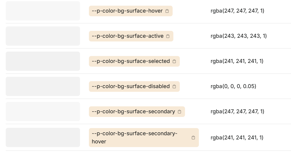
This is better! Rather than risking a loss in translation between mockup and implementation due to developers not having a keen eye for color shades, designers have specified token use up-front.
Now, I’m not begrudging designers their colors. It’s their right and inclination to get really in the weeds with it. But when thinking about my own personal system, scrolling down the Polaris color token list had me questioning things. In fact I’ve never made it to the end of that thing. I did open console and count the number of table entries: 226 colors!
Here’s my take: I’m fairly sure nobody would really notice the difference between many of these closer shades of gray if seen side-by-side. Of course, that’s not a fair critique, because these tonal changes are contextual. The difference between press and hover colors is meaningful only when you transition between them in response to a user action.
However, by specifying all these colors as a flat list, we also flatten that context. I suspect that a lot of effort and thought is basically wasted navigating that loss of context! We are, essentially, unwrapping a single system rule of (e.g.) “background should get a tiny bit darker when hovering and darker when pressing” into 10s of individual tokens, each applied to different color ranges. This increases the complexity space of the tokens across two axes: count and token length. If we have N contextual color states (hover, pressed, etc), we require N * M tokens to represent them, and each token name must include at least one additional identifier (-hover, -pressed, and so on). If you look at Polaris tokens, you see this in action: hundreds of colors with multi-identifier names like bg-surface-secondary-active.
What if we didn’t flatten these contextual rules into token lists, but instead encoded them as rules within the system utilities?
-lighten and -darken utilities
After working with several design systems that experienced token explosion, I started to develop an idea for what I thought might feel better, as a developer: encoding color state rules as utilities, and minimizing the color palette range to a handful of easy-to-remember values.
Your toolbox looks something like this:
- 5 palette values:
wash,light,default,dark,ink - 2 tweak utilities:
-lighten-[n]and-darken-[n]
With this combination, you can express various color states fairly succinctly:
const Button = () => (
	<button
		className={clsx(
			"bg-primary-light color-primary-ink",
			"hover:bg-lighten-1 active:bg-darken-1"
		)}
	/>
);
This is the same number of utilities as you’d use with named color tokens (i.e. hover:bg-primary-hover, etc), but the cool part is what happens when you do this:
// composing the prior Button, with a customized color palette
const AccentButton = () => (
	<Button className="bg-accent-light color-accent-ink" />
);
Unlike named color tokens, the color state rules automatically adapt to changes in the colors they are computed from! Our composing component doesn’t have to specify any hover or active state, it inherits the behavior of Button, while overriding its source values.
With this system we get a more adaptable, easier to maintain way to encode color state changes, and we also have fewer color tokens to think about.
How I built it
To make these new util classes work, I leveraged Uno’s complete customizability to rework how bg-, color-, and border- class utilities work. Instead of applying a token value directly to the CSS property in question, they now set up a custom property assignment.
.bg-accent-light {
	background-color: var(--v-bg);
	--v-bg: var(--color-accent-light);
}
Now, that alone doesn’t seem to do much. But now, we can either alter or reference the --v-bg property in other places and affect the final applied background-color:
/* NOTE: don't use this! It doesn't work! */
.bg-lighten-1 {
	--v-bg: hsl(from var(--v-bg), h, s, calc(l + 0.1));
}
As noted in the comment, this doesn’t actually work: CSS properties cannot be circular; I can’t assign --v-bg to something derived from --v-bg.
So the final implementation looks like this, using an intermediate -altered property:
.bg-accent-light {
	background-color: var(--v-bg-altered, var(--v-bg));
	--v-bg: var(--color-accent-light);
}

.bg-lighten-1 {
	--v-bg-altered: hsl(from var(--v-bg), h, s, calc(l + 0.1));
}
In my actual system, I use OKLCH for colors and conversion, but HSL is a little easier to grasp.
Avoiding inheritance of altered values
This may not be obvious, but one final thing that must be done here is disabling inheritance on the --v-xxx-altered properties. You can do this with a CSS property spec:
@property --v-bg-altered {
	syntax: '*';
	inherits: false;
}
If we don’t do this, then any parent element with an altered color will override the assigned color of children, since the altered form takes precedence in the assignment var(--v-bg-altered, var(--v-bg)).
It gets better
That’s pretty much the basic mechanics of how the lighten and darken utils work. I’ve omitted light/dark mode support, which requires setting a global property --color-mode-mult: -1 for dark mode and using that to reverse the l calculation.
But then I started noticing some things!
One of my favorite phenomenon is when a small change to how a system behaves yields knock-on benefits to other unrelated parts. Once I had this property-based system in place for my bg, color, and border utilities, it dawned on me that I could easily implement some “magic” color tokens:
.border-color-bg {
	border-color: var(--v-bg-altered, var(--v-bg));
}
It’s kind of like the border: currentColor trick, but generalized. I can set any of color, bg, border, ring, or shadow to any other of those values.
Note: I use
colorandfginterchangeably in these utils; both work, but I findfgis less ambiguous when paired with prefixes likeborder-color-—border-color-coloris silly!
Not only that, but it’s the “live” value—meaning, when you hover and it applies bg-lighten-1, that lightened color is seamlessly also applied to the border. And if a user of the component overrides bg, it will likewise carry over to the border, too. This can also be used for shadows and focus rings.
The magic here is just this: border-color-fg ring-color-fg ring-color-lighten-4 hover:color-lighten-4
Notice how in this demo, the ring is altered to be lighter than the border, and this relationship persists even when the hover state alters the source color! This wasn’t even by design but works remarkably well in practice.
Note: if you’re in dark mode, automatic logic will make these
lightendemos darken instead. “Lighten” and “darken” are interpreted more like “blend more into the page” and “stand out more from the page” in my system.
It turns out this simple trick leads to a lot of expressiveness with styling rules. And that’s not even all…
Super inheritance
CSS properties inherit by default, so now any children of elements with these utils applied can know what color, background, and border their parents have.
Which means we can write styles which express adaptable concepts like “border mimics the background color of the parent, but darker,” without having to specify variants or do any user configuration at all.
<div class="bg-primary-wash">
	<div class="border border-solid border-bg border-darken-5"></div>
</div>Since the inner div doesn’t have its own bg- rule applied, it inherits from the parent. We can make a component that uses this behavior and adapts to any parent background you place it in.
You could achieve a basic approximation of this with opacity, but sometimes transparency has its own issues with adaptive composition. This is a much more direct implementation of the intent, in my opinion.
Here’s another cool place this works: shadows! If you’re using box-shadow to implement a scroll shadow to make content ‘fade out’ near the edge, you can inherit the shadow color from the container’s background color—and it works every time, on any color surface.
.shadow-bg-lg {
	box-shadow: 0 0 12px 24px var(--v-bg);
}I enjoy using scroll shadows and fades so this is a huge win for me. In the past, they’ve always been fiddly to avoid mismatched colors.
Caveats
As with any more complicated system, the rewards come with risks.
Implicit inheritance
There is now an implicit, ambient color inheritance which may lead to unexpected behaviors. If a component doesn’t use a bg- utility on itself, for instance, its --v-bg value will inherit from the parent. This powers tricks like the ‘super inheritance’ above, but also means any component in isolation cannot assume --v-bg is in a default state if it’s not been assigned.
If it sounds like this would cause all children to innately inherit their parent’s background, don’t worry, that’s not the case—since without actually specifying background-color: var(--v-bg);, the property alone will not do anything. It’s just something you may trip up on in unexpected circumstances.
Really, though this is also how many CSS properties already work, like font-size. It doesn’t feel too unnatural to me, at least.
Design accessibility
Not to be confused with a11y, what I mean here is that the definition of the design system is now more directly reliant on the technical implementation, not the other way around. This is probably harder to do in a team with dedicated designers and developers, whereas I’m the only person working on my pet ‘design system.’
Where this can be an issue is with stuff like bg-darken-1. It’s the developer’s implementation which determines what “darken” means here. Figma can’t mimic that out of the box, so in order for designers and developers to speak the same language, you either need to approximate these utilities with hardcoded design tokens at the design phase (e.g. bg-primary-darken-1, bg-primary-darken-2…) or extend the design tool to use the exact same darken/lighten calculation in some other way (Figma plugins? I don’t even know if this is possible).
So, this may end up only shifting the token mess more onto the design side. That’s not a very nice thing to do. I would think carefully before trying to implement something like this on a team and make sure the tools are aligned between design and development so ideas are easy to translate between the two.
Reliant on utility classes
The approach I’ve taken is very dependent on staying within the UnoCSS-powered utility class system. When authoring pure CSS, while you still have access to token properties, tools like lighten are not available, since they’re all preprocessed. This can be inconvenient.
One more thing…
This wasn’t the end of my quest to reduce the number of color tokens I had to care about. Oh no! My real goal was 4 colors… total. But that begins to veer from practical to obsessive, so I’ll leave this article as-is and dive into that some other time.
← All posts